2018 |
[CLIENT] Spicy Bros |
Hong Kong |
[CORPORATE IDENTITY] [LOGO DESIGN] [MENU DESIGN] [GRAPHIC DESIGN] [STORE FRONT DESIGN] [LABEL DESIGN] |
[AWARDS]
London International Creative Competition, 2018 — Honourable Mention in Application Design, Professional 
|
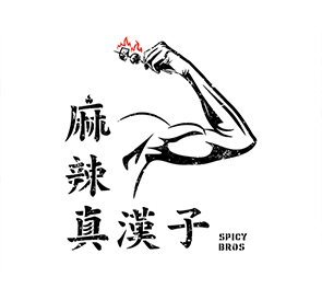
麻辣真漢子 Spicy Bros is a Sichuan spicy skewer food stall in Hong Kong, targeting secondary and university students and local Hong Kongese who love street food.
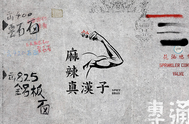
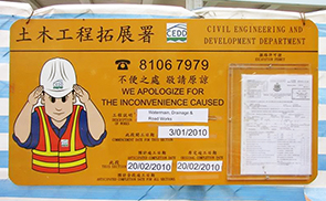
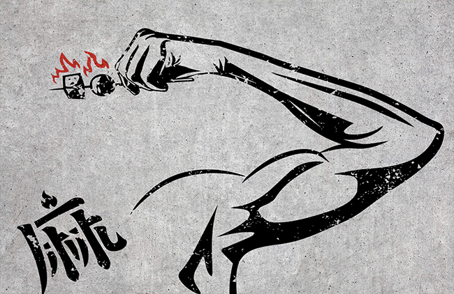
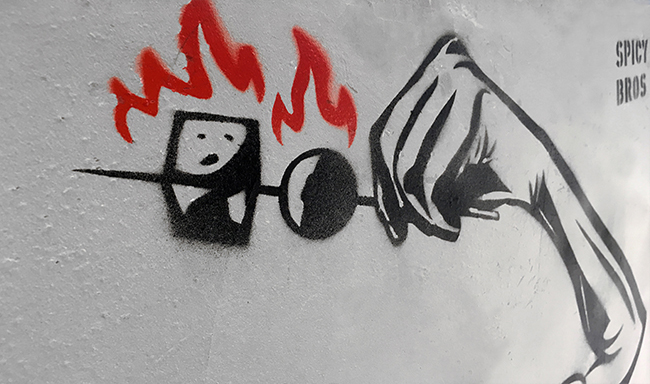
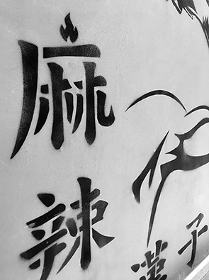
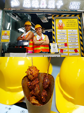
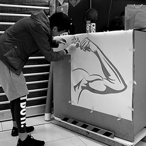
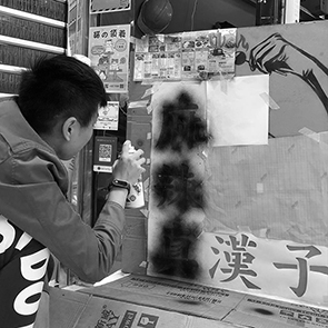
We helped out to design the logo and the store front of the shop. We used a muscular arm holding a hot and spicy skewer as the logo to symbolise the style of those strong and bold construction workers, uniting with the Chinese name of the brand. We even used a stencil style to give a graffiti and under construction feeling. For the typography treatment, we pick the classic Chinese regular script (粗楷體) and modified it to make it look like local Hong Kong classic signages. Spices are hidden in the Chinese characters to emphasize the spicy of their skewers.
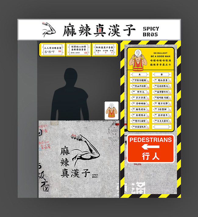
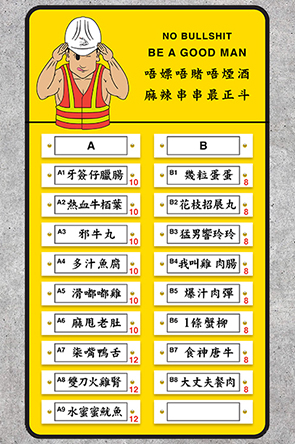
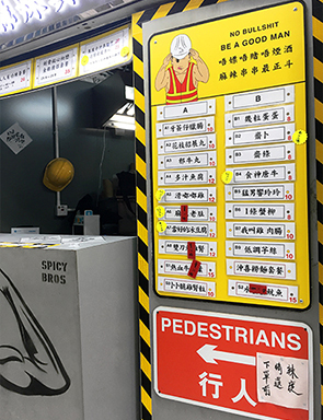
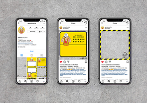
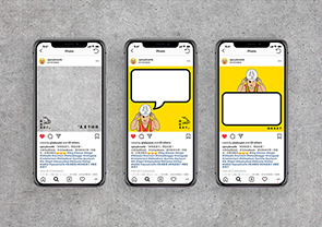
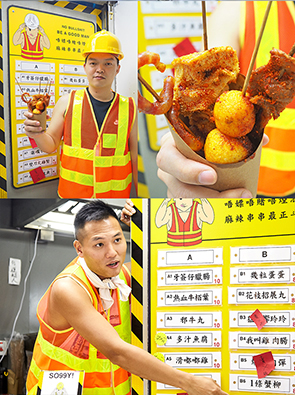
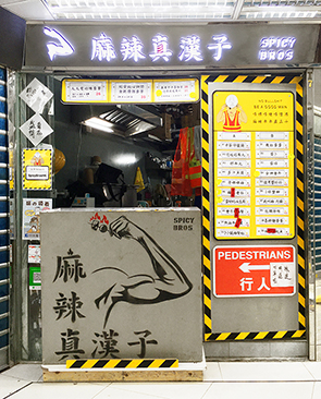
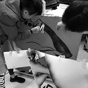
For the store front, we mimicked a under construction site by using concrete textured walls. We designed the menu in the style of the typical yellow colour road signage of construction area in Hong Kong. We also created a muscular worker in graphic style as a brand character.
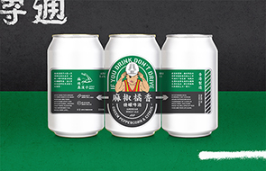
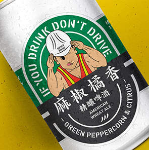
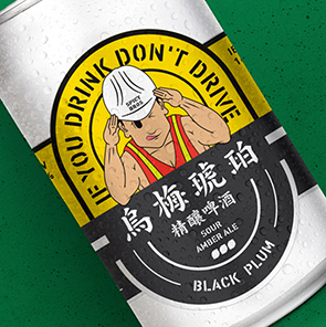
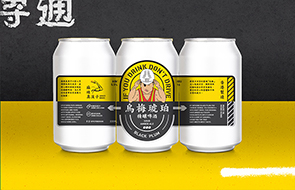
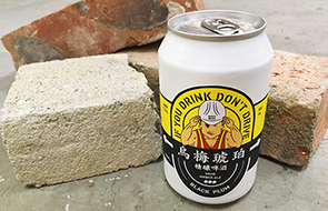
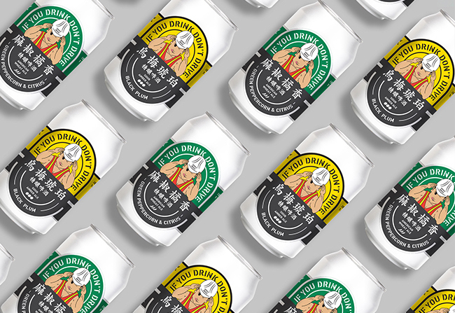
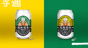
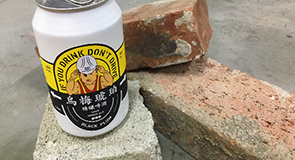
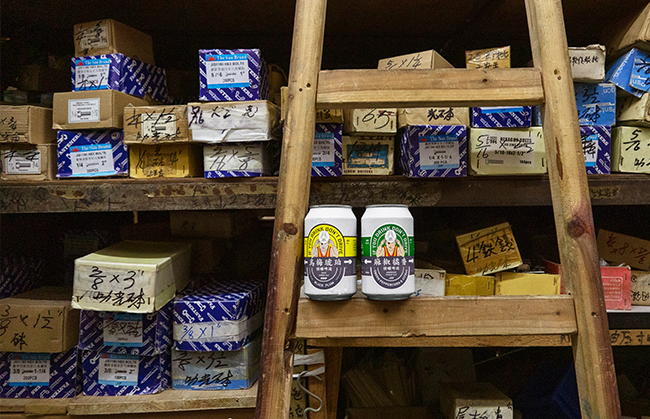
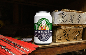
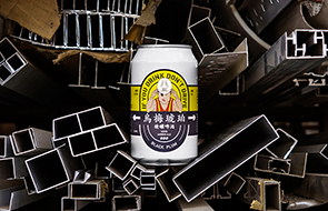
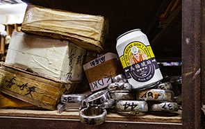
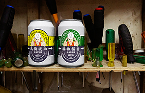
For the local beer label design, there is an oval shape inspired by the classic beer in Hong Kong, Tsing Tao. Yet, we added elements of Spicy Bros, Hong Kong road signs and spray paint typography, and of course, the signature so99y brand character to create the local and masculine design. The two flavours are divided by two colours, yellow for Black Plum and green for Green Peppercorn & Citrus.
109
Spicy Bros
Branding
[Crafting the bromance]

Spicy Bros
Branding
[Crafting the bromance]

