2019 |
[CLIENT] Oxfam Hong Kong |
Hong Kong, Macau |
[GRAPHIC DESIGN] [POSTER DESIGN] [MERCH DESIGN] [TYPOGRAPHY DESIGN] [ADVERTISEMENT DESIGN] [LAYOUT DESIGN] [ONLINE OFFLINE MATERIALS] |
[IMPACT]
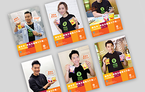
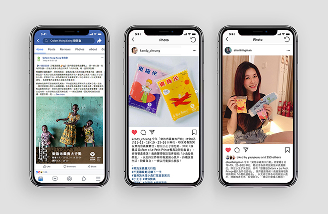
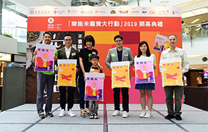
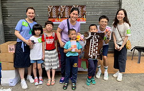
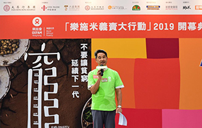
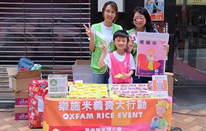
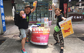
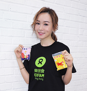
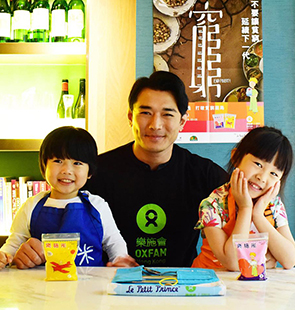
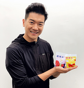
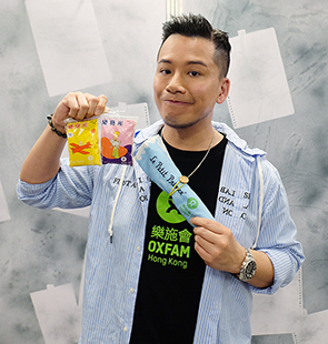
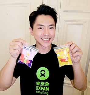
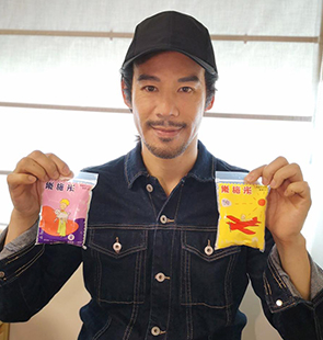
More than 10 Hong Kong and Macau celebrities, over 200+ companies, organisations, schools and government organisations and over 4,000+ volunteers supported the campaign. More than HK$2 million has been raised throughout this campaign. |
[AWARDS]
International Design Awards, 2020 — Silver in Graphic Design, Print-Key Art — Silver in Graphic Design, Print-Direct Mail  
|
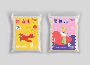
Oxfam Rice campaign is a signature annual event hold by Oxfam Hong Kong, the net proceeds from the rice packs sold are donated to help 600 million small farmers around the world for a better and sustainable living.
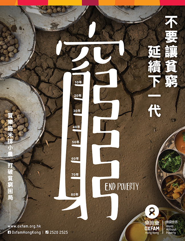
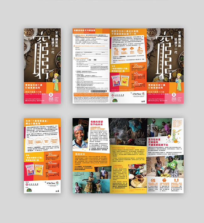
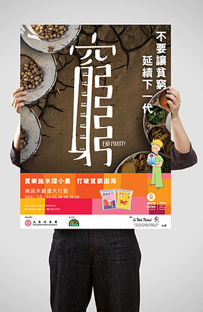
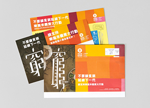
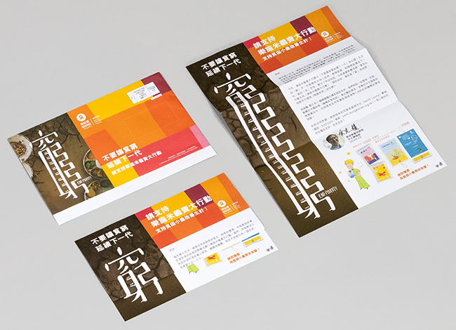
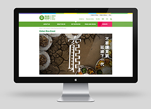
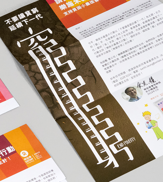
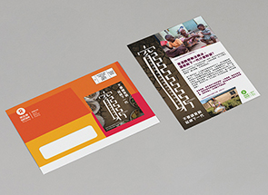
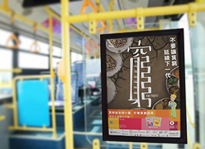
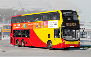
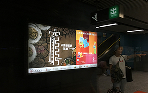
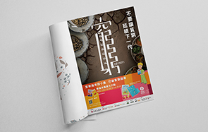
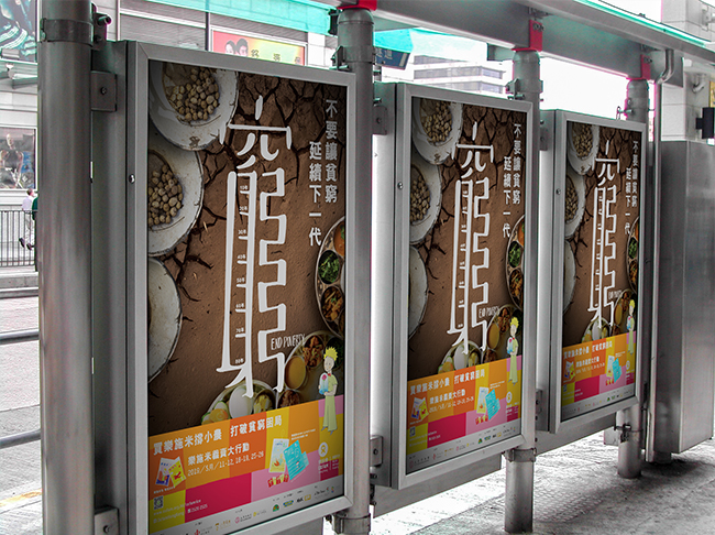
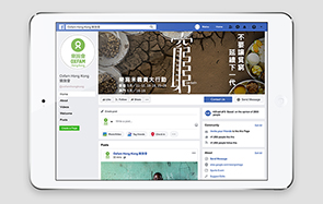
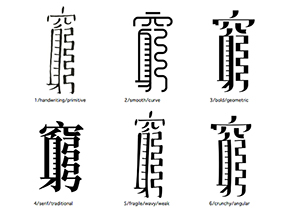
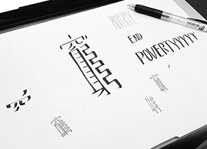
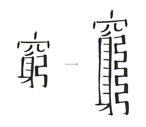
We have brainstormed different ideas for creating an eye-catching key visual. The final concept falls back to the core mission of Oxfam, end poverty. We have the Chinese word of poverty, "窮", handwritten at the center of the key visual as the main focus. It looks weak and shaky. The middle part of the word is repeated in a few times, which makes the lower part of the word, "身" and "弓", look like a ladder and a maze like route, meaning endless poverty that couldn't able to escape. There are some ascending decades indications inside the word, just like a timeline, representing poverty being inherited and prolonged. The background has a dry land with little food on the top left side to a fertilised land with fruitful meals, implying the change that you can help. The tagline on the top right corner brought out the key message of "Don't let poverty continue on to the next generation".
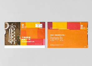
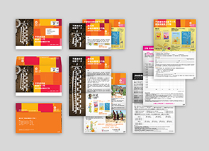
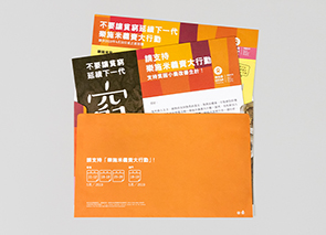
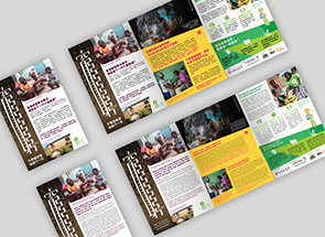
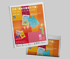
For the direct mail design, we created a stretchable poverty, "窮", that can be extended when opening the leaflet inside. It can create a greater impact with this little interaction.
114
Oxfam Hong Kong
Rice Campaign
[Seeing the endless poverty]

Oxfam Hong Kong
Rice Campaign
[Seeing the endless poverty]

